Creating the GDUSA Award-Winning Biovanta Website & the Relationship Behind It

Creating the GDUSA Award-Winning Biovanta Website & the Relationship Behind It

Creating the GDUSA Award-Winning Biovanta Website & the Relationship Behind It

Winning a GDUSA award is always exciting because it’s both a celebration of our designers’ hard work and a time to reflect on our partnership with a client in relation to the project itself. We’re only as good as our last project after all, and our partnerships make us who we are. So let’s take a dive into not just creating the GDUSA award-winning Biovanta website, but into how it all came to be.

Evolving All the Time: The Vision & Biovanta Partnership

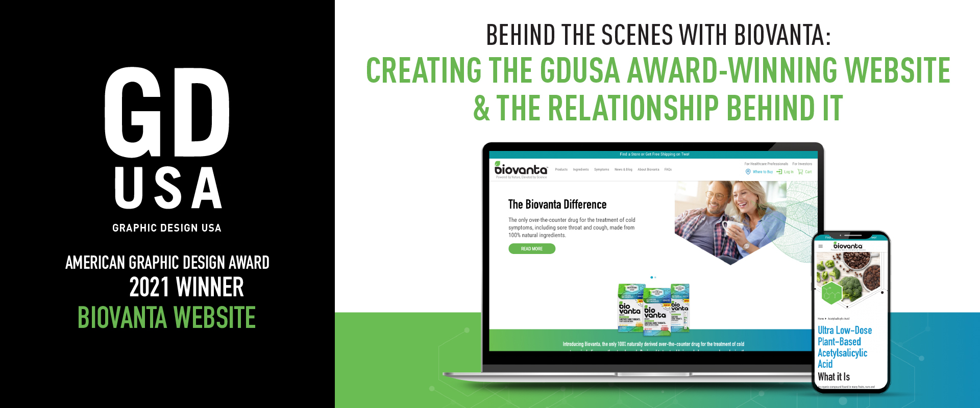
This year, we had the privilege of redesigning, expanding, and optimizing a website for Biovanta, the only 100% natural over-the-counter drug for sore throats, colds, and coughs. If you haven’t heard of Biovanta yet, you will soon. Owned by a husband and wife and based in Brooklyn, they’re growing at warp speed and have been eager for an optimized, clean website to serve as their home base while they build out their distinct brand. We crossed paths with the young company a year ago when they needed a quick demo video of a product. It was important to have a quick turnaround so they could keep things in motion. After the demo, we started offering strategy and support for their Amazon assets and website. One thing led to another and we began collaborating on a full website redesign for this forward-thinking new business and product. 

The Ask

Even though this was technically a website redesign project, it was also an outward expansion in every sense. We added blogs, detailed product pages, and reviews to make the site more robust, and collaborated with our friends at Seasons Communications to optimize SEO and improve the user experience. 

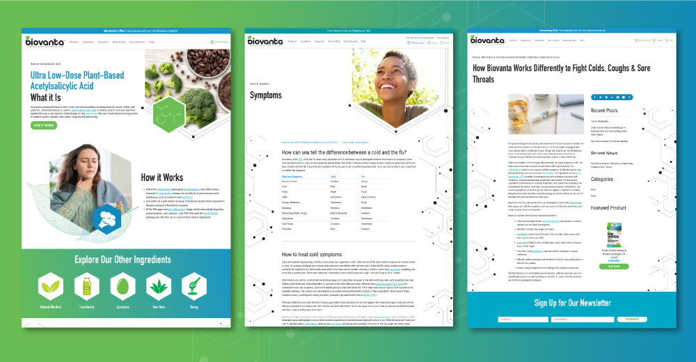
GDUSA Award-Winning Biovanta website redesign pages

Why Redesign a Website?

While a website redesign often conjures thoughts of new visuals, better functionality, and a cleaned-up look–all of which were part of this project–every web design project is different because it is rooted in strategy. Rather than simply aiming to make the site more pleasing to Biovanta’s audience’s eyes, we had to consider where Biovanta was in its journey as a business and what the site needed to accomplish when someone landed on it. Your website is your mothership in many ways; it is the place where your audience lands once you’ve captured their attention. It’s the place where you show your stripes and where your voice, values, and intentions need to be all-encompassing. In a way, you’re creating your own little reality for people to step into and experience. So, what does an all-encompassing Biovanta reality look like?

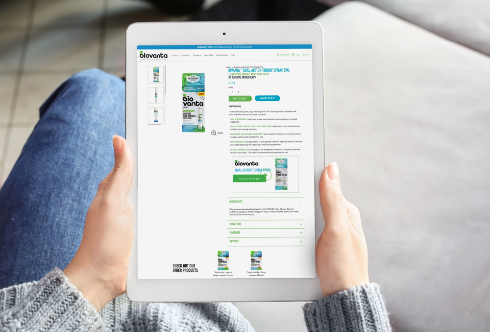
GDUSA Award-Winning Biovanta website redesign tablet view

Website Design & Branding: More Connected Than They Seem

Since this project was a redesign of an existing site rather than the creation of a site from scratch, we had to be careful not to tinker too much with the structure. As a budding, busy company, Biovanta needed to continue to keep their site available to their audience. We struck a balance between maintaining a level of consistency for incoming traffic and making progress optimizing different areas of the site. The site’s development was also driven by a quickly encroaching cough/cold season. Working closely with the client and their SEO partner made it possible for us to layer our designs with strategy, enabling Biovanta to take advantage of their new site when they needed it most.

No matter what the project is, branding always comes into play. Whether you’ve been around for decades or you’re just now crafting your identity, determining how to represent your brand is the eternal question. As a fast-moving company with countless opportunities on the horizon, ensuring that the Biovanta brand came across clearly on the new site was essential. The website design became a vehicle for building out the look, tone, and feel of the Biovanta brand. 

The Design & Look

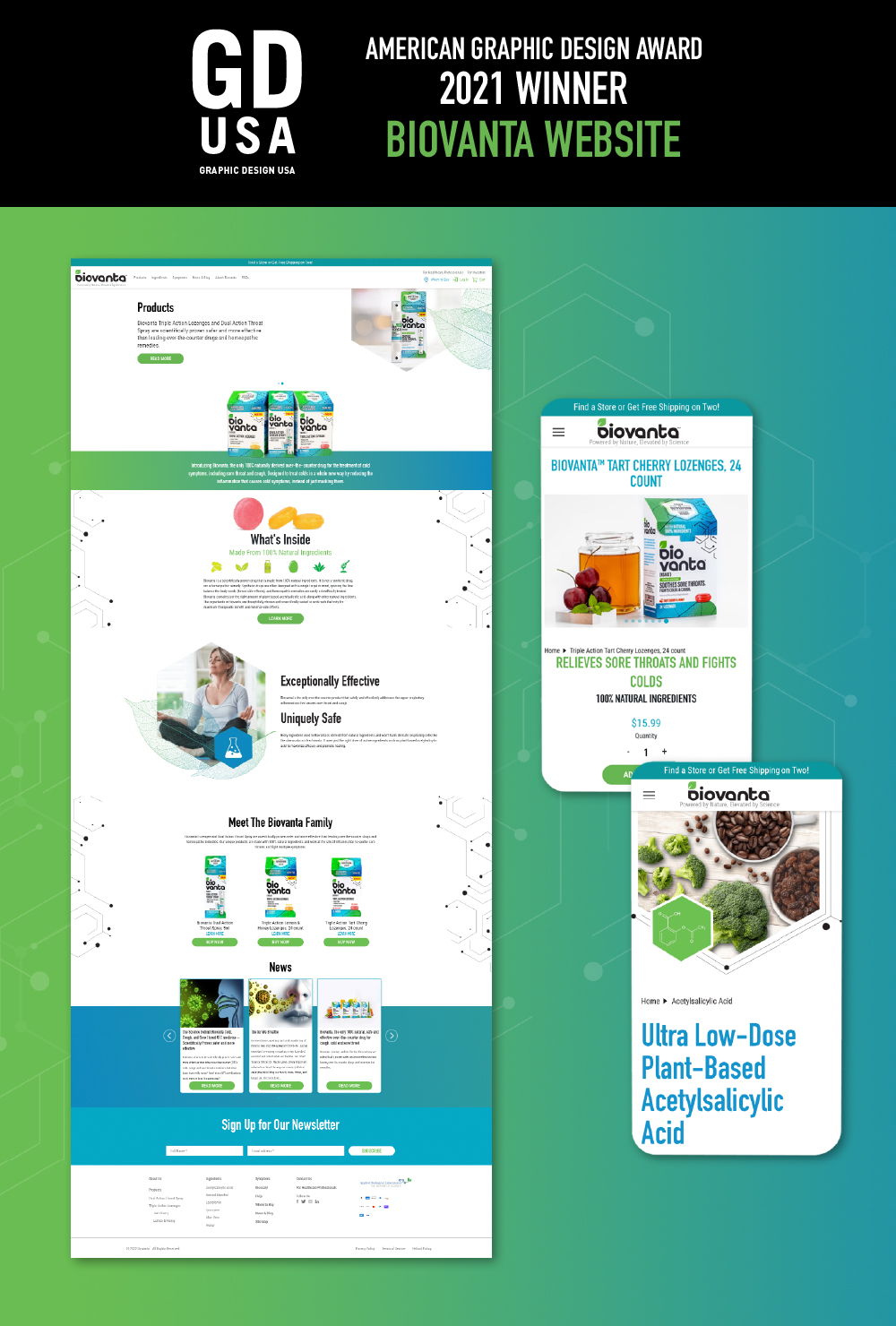
We kept it simple with a clean, modern, and user-friendly design, aiming not to over-design anything. Since Biovanta prides itself on its natural, simple ingredients and messaging to match, the site needed to embody those elements. Biovanta’s soon to be iconic blues and greens translated from packaging to website seamlessly. Their science-focused and confident identity came to life in a minimalist space with a fluid user experience. Icon-like graphics of ingredients and the consistent use of hexagonal shaped imagery makes clear associations with Biovanta’s foundation in science while also helping to create an uncrowded space that is easy to navigate. 

GDUSA Award-Winning Biovanta website redesign desktop and mobile view

The End Result

We were able to collaborate intimately with the client and get a firm grasp on what was essential to include. The results were easily accessible content pages filled with clear and empowering information, both about colds and how Biovanta’s products alleviate their symptoms. The space and user experience mimic the tonality of the brand and the effectiveness of the product–efficient, simple, and 100% natural. Creating the GDUSA award-winning Biovanta website truly paired strategic with creative, and working so closely with one another made the site look and feel like a cohesive representation of their vision and this incredible new brand.

We’re so proud of how far our partnership has come in the past year and we can’t wait for the next project. Cheers, Biovanta!

Thinking about your next website project? Contact us and we’ll get started!

The AMI Digital Summit: The Flight Crew Heads to Chicago

The AMI Digital Summit: The Flight Crew Heads to Chicago

Our Flight Crew makes penguins fly from the East Coast most days, but that doesn’t mean we don’t love spreading our wings every once in a while–especially when it’s to hone our skills so we can become even smarter, more efficient, and more digitally savvy when it comes to the latest industry happenings.
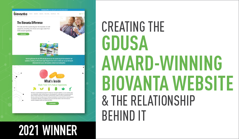
Creating the GDUSA Award-Winning Biovanta Website & the Relationship Behind It
Creating the GDUSA Award-Winning Biovanta Website & the Relationship Behind It

Winning a GDUSA award is always exciting because it’s both a celebration of our designers’ hard work and a time to reflect on our partnership with a client in relation to the project itself. We’re only as good as our last project after all, and our partnerships make us who we are. So let’s take a dive into not just creating the GDUSA award-winning Biovanta website, but into how it all came to be.

Grassroots Marketing

Grassroots Marketing

We recently brought a grassroots marketing campaign to life in Central Park for the family-owned snack company John Wm. Macy’s. Our experience got us thinking about the core aspects of grassroots marketing and audience engagement, and what it takes to create a successful campaign. It’s a layered concept, so let’s dive in together.

Award-Winning Design Series: G-SHOCK Tactical Product Catalog

Award-Winning Design Series: G-SHOCK Tactical Product Catalog

About G-SHOCK:

G-SHOCK watches are synonymous with toughness. It all started in 1981 with developer Kikuo Ibe’s dream of “creating a watch that never breaks.” Focusing on the “Triple 10” concept of 10-meter dropping shock resistance, 10-bar water resistance and 10-year battery life, his project team rigorously tested over 200 prototypes. The first G-SHOCK finally hit the streets in 1983 and soon established itself as “the toughest watch of all time.” Over the next 35-plus years, the G-SHOCK line expanded at a rapid pace, introducing new models and advanced features while retaining its iconic shock resistant structure. Today, G-SHOCK is one of the world’s most recognizable brands and continues to set the standard for timekeeping toughness with innovative technologies, functions and designs. 


Gearing Up for an Award-Winning Project:

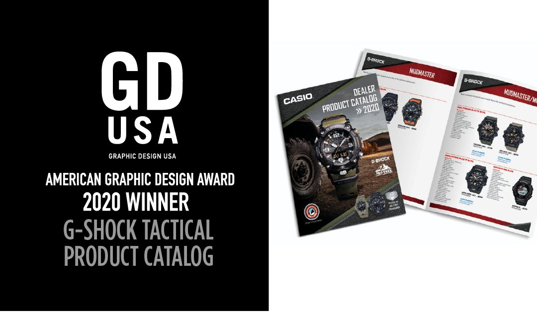
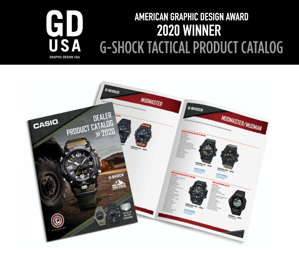
During our 15-plus years of working on countless projects together, Vision has become completely immersed in the G-SHOCK brand. Each year, our team is tasked with updating the G-SHOCK tactical watch product catalog to showcase the latest timepiece releases and promote the entire tactical product line. The catalog is organized to separate the timepieces by model and colorway for easy selection and includes full product specifications. Vision provides the overall design concept, researches and recommends stock photography, and provides additional watch photography as needed. For this year’s edition, our team focused on deep, earthy colors and textures of rock and metal to speak to the virtually indestructible nature of the watches. The design brings a fresh look to the catalog while staying true to the line’s identity with images and elements that resonate with the primary audience of firefighters, military, police and emergency response personnel.


The Results:

The 2020 tactical catalog features an updated and impactful design that successfully aligns with the tactical theme. It’s sure to catch the eye of dealers and retailers and clearly communicates the functions and features of each timepiece. This year, we submitted our design for the tactical catalog to GDUSA Magazine for the first time, and we’re proud to say that we took home another graphic design award.

View Our GD USA Award Feature

See Our Other Award-Winning Work:

See all of our award-winning designs 2018-2020

The AMI Digital Summit: The Flight Crew Heads to Chicago

The AMI Digital Summit: The Flight Crew Heads to Chicago

Our Flight Crew makes penguins fly from the East Coast most days, but that doesn’t mean we don’t love spreading our wings every once in a while–especially when it’s to hone our skills so we can become even smarter, more efficient, and more digitally savvy when it comes to the latest industry happenings.

Creating the GDUSA Award-Winning Biovanta Website & the Relationship Behind It

Creating the GDUSA Award-Winning Biovanta Website & the Relationship Behind It

Winning a GDUSA award is always exciting because it’s both a celebration of our designers’ hard work and a time to reflect on our partnership with a client in relation to the project itself. We’re only as good as our last project after all, and our partnerships make us who we are. So let’s take a dive into not just creating the GDUSA award-winning Biovanta website, but into how it all came to be.

Grassroots Marketing

Grassroots Marketing

We recently brought a grassroots marketing campaign to life in Central Park for the family-owned snack company John Wm. Macy’s. Our experience got us thinking about the core aspects of grassroots marketing and audience engagement, and what it takes to create a successful campaign. It’s a layered concept, so let’s dive in together.
Award-Winning Design Series: MetTel 5G Presentation

Award-Winning Design Series: MetTel 5G Presentation

About MetTel:

MetTel is a leader in communications and digital transformation (DX) solutions. Founded in 1996, MetTel converges all communications over a proprietary network to give enterprises a single unified view and control point for all their communications and advanced network services. The company’s comprehensive portfolio of customer solutions can boost enterprise productivity, reduce costs and simplify operations. Combining customized communication solutions with a powerful platform of cloud-based software, the MetTel Portal® enables customers to manage their inventory, usage, spend and repairs from one simple, user-friendly interface.


Dialing In On This Award-Winning Project:

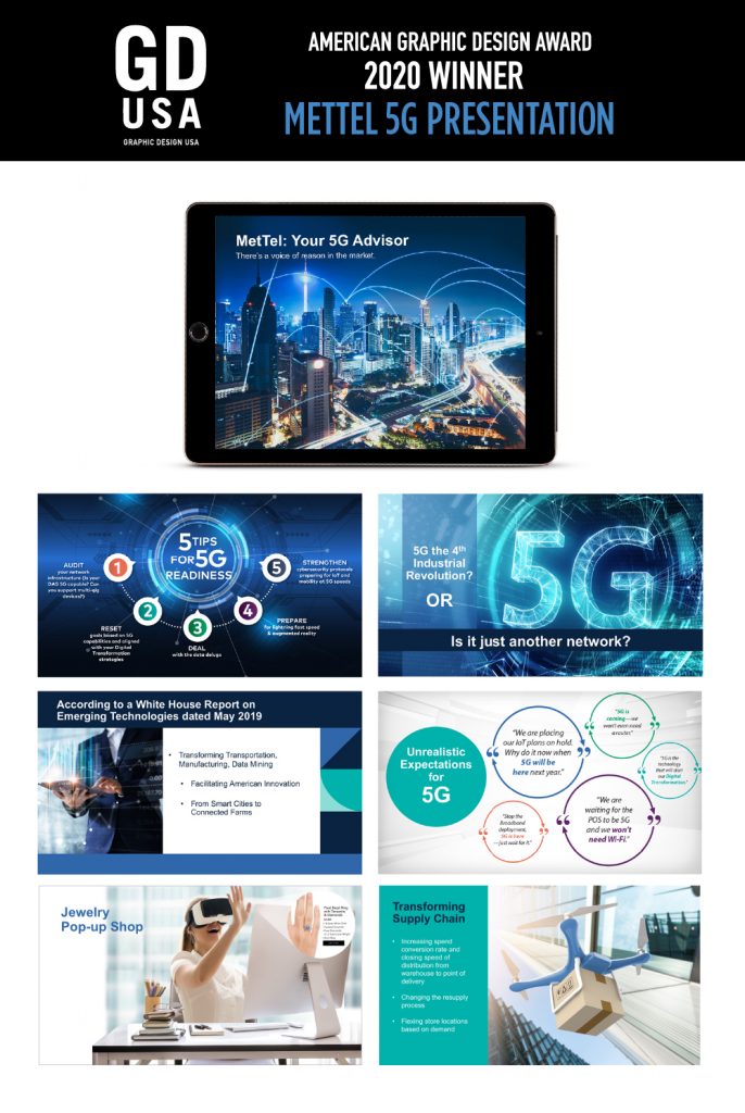
MetTel was preparing to serve as keynote speakers at the Gartner Symposium, the premier IT leader conference. They were looking to make a big impact and needed powerful visual support for two presentations: How 5G Will Help Retailers Survive & Thrive and The Potential & Perception of 5G for Government. Our team took on the challenge of creating key visuals that would take these concepts and bring them to reality. The main objective  was how best to illustrate 5G, connecting future technology with real-world usage, and bring it all together with MetTel’s comprehensive solutions.  We proceeded with a balanced approach, utilizing futuristic visual textures, patterns, animations and graphics, which were then complemented with renderings of real-world applications paired with informative and factual copy. The final product positions  MetTel at the forefront of their industry and helps the audience clearly understand the potential of 5G and how to evaluate and deploy this new technology.


The Results:

Our award-winning presentation garnered the attention and trust of the audience with precise messaging and a cohesive design. Showcasing MetTel as an industry expert that can separate the hype from reality and help businesses select the right 5G strategy and services, it made a strong impression on attendees and generated new business leads.

View Our GD USA Award Feature

See Our Other Award-Winning Work:

See all of our award-winning designs 2018-2020

The AMI Digital Summit: The Flight Crew Heads to Chicago

The AMI Digital Summit: The Flight Crew Heads to Chicago

Our Flight Crew makes penguins fly from the East Coast most days, but that doesn’t mean we don’t love spreading our wings every once in a while–especially when it’s to hone our skills so we can become even smarter, more efficient, and more digitally savvy when it comes to the latest industry happenings.

Creating the GDUSA Award-Winning Biovanta Website & the Relationship Behind It

Creating the GDUSA Award-Winning Biovanta Website & the Relationship Behind It

Winning a GDUSA award is always exciting because it’s both a celebration of our designers’ hard work and a time to reflect on our partnership with a client in relation to the project itself. We’re only as good as our last project after all, and our partnerships make us who we are. So let’s take a dive into not just creating the GDUSA award-winning Biovanta website, but into how it all came to be.

Grassroots Marketing

Grassroots Marketing

We recently brought a grassroots marketing campaign to life in Central Park for the family-owned snack company John Wm. Macy’s. Our experience got us thinking about the core aspects of grassroots marketing and audience engagement, and what it takes to create a successful campaign. It’s a layered concept, so let’s dive in together.

Award-Winning Design Series: Maxell USA Website Redesign

Award-Winning Design Series: Maxell USA Website Redesign

About Maxell:

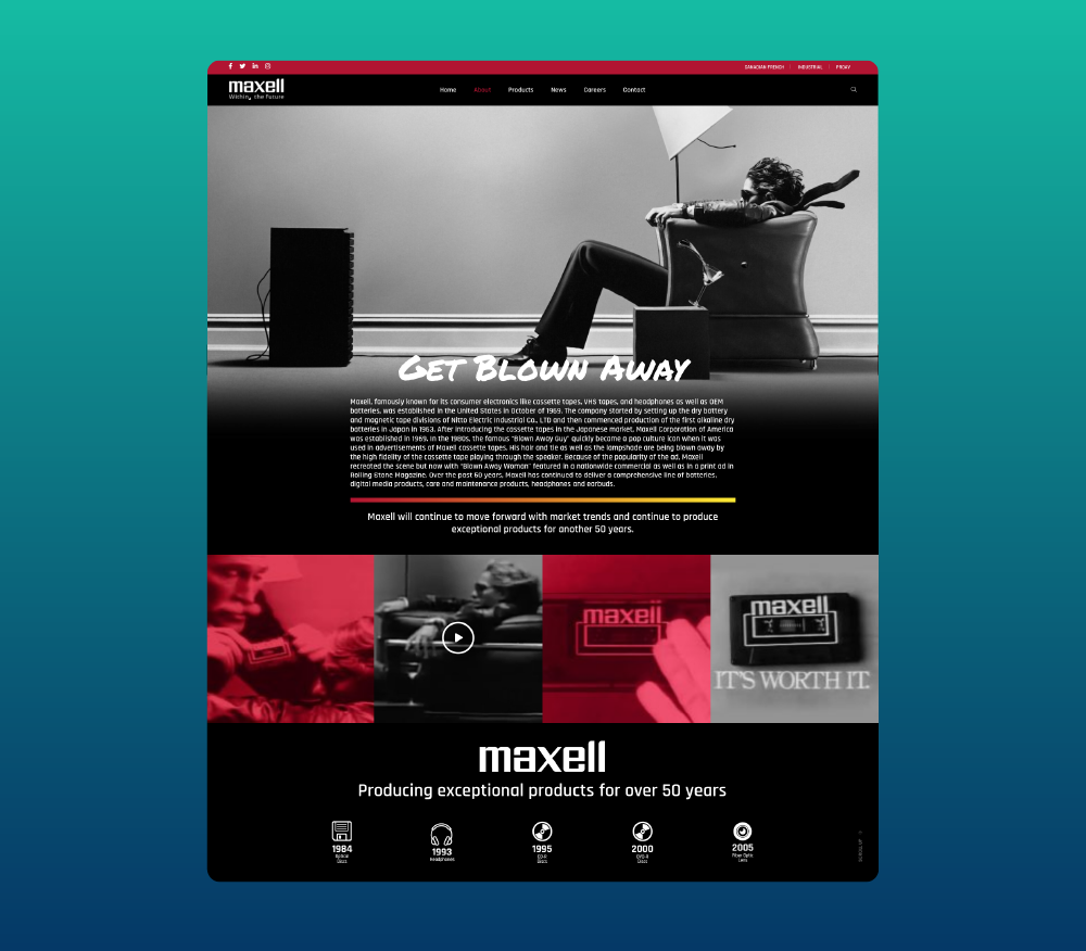
Maxell has been recognized for over fifty years for its exceptional consumer electronics, including cassette tapes, VHS tapes, headphones, and batteries. In addition to technological innovations, in the 1980s Maxell also gave birth to a true pop culture icon through its popular ads featuring the “Blown Away Guy” with his hair and tie being blown away by the high fidelity of the cassette tape playing through the speaker. Today, Maxell offers a comprehensive line of headphones, earbuds, batteries and digital media products as well as care, maintenance and storage products.


Kicking Off this Award-Winning Project:

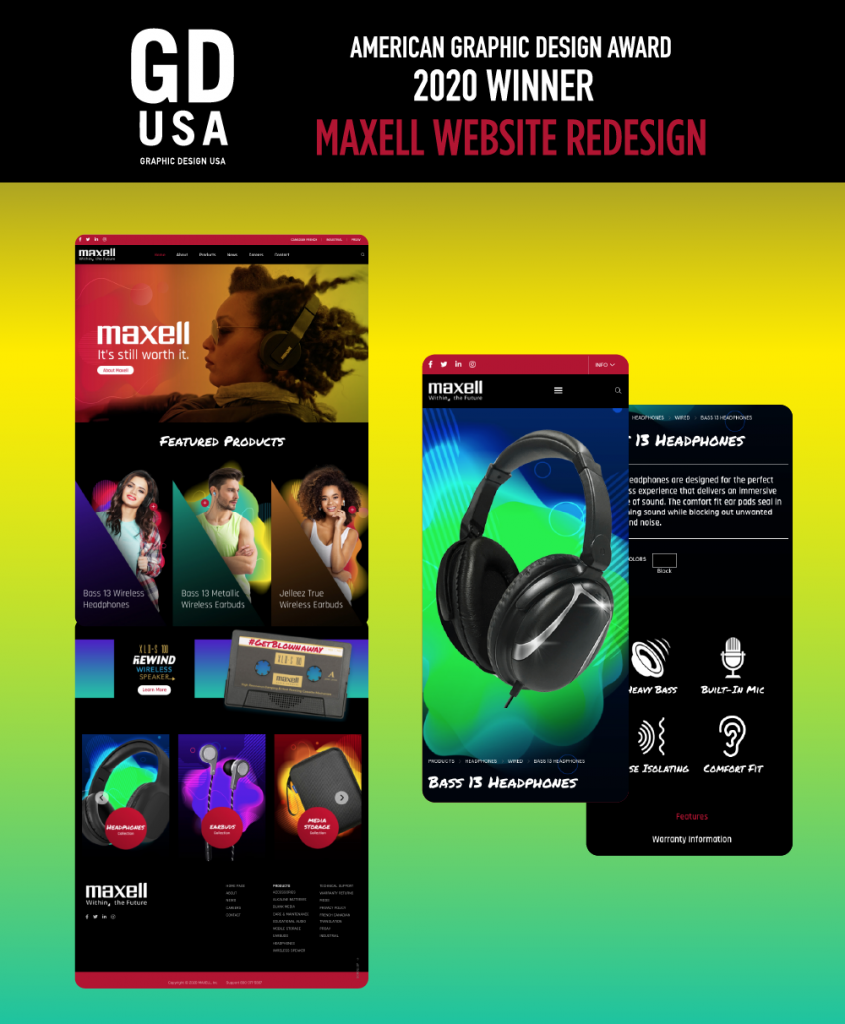
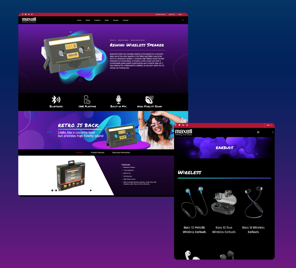
Hoping to reengage their brand with a new generation, Maxell came to Vision looking for a bold, new and responsive website that would reflect their retro-modern style. The original “Blown Away” ad and the newly reimagined 2005 revival featuring new products and a fierce “Blown Away Woman” both resonated with our team and inspired us throughout this project. We kicked everything off by completely immersing ourselves in the Maxell brand, really putting our fingers on the pulse of the company and what it means when they say “it’s still worth it.” Diving into their history, current product offerings, competition, target audience, brand positioning, and marketing objectives, we first partnered with Maxell on a creative brief and identified the goals for this project. Running with this knowledge, we then created a digital mood board, exploring colors, graphic treatments, and fonts with the mindset of paying homage to the charismatic nostalgia of the brand while creating a fresh, stylish design. Incorporating a mobile-first approach with the user-experience at the forefront, VCG then designed and developed a completely new WordPress website that communicates that their products are undoubtedly “Still Worth It.”


The Results:

Since launching the new website, Maxell has received positive feedback internally and from both customers and other companies. Extremely user-friendly, engaging and responsive, the website combines a cool, modern look with a nod to this classic brand’s history. We are proud to say the site’s design earned our team another award from GD USA Magazine!

View Our GD USA Award Feature

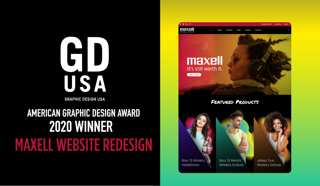
Maxell Website GDUSA Award Winner

Client quote: "Honestly it has been a great experience for the whole development on our website and new project. Since the launch we have received so much feedback and customers and companies reaching out to us. Truly helped us resurrect our brand. Vision made the process so simple. Working with their team was just seamless and made it easy. Now our new site is a great representation of our brand. Thank you so much, you guys are amazing!!! We are blown away from their service." Eric Walbrecht, Maxell USA

Maxell USA About us page

Client quote: "I am stunned at how well the final website came out! When we asked for creative ideas, Vision went above and beyond and exceeded our expectations in a very timely manner. The communication was constant and we always knew what stage the website was at. Overall it was a great experience working with you all, and I look forward to continuing work on more projects! Lori and the rest of her team at Vision are always super helpful and continue to exceed expectations. The team listened to our ideas and what we were looking for and went above and beyond. Our website came out amazing thanks to their creative ideas, expertise, and dedication. We couldn't have asked for a better website or a better team to work with!" Patrycja Mioduszewski, Maxell USA

Maxell USA product page and product category page

See Our Other Award-Winning Work:

See all of our award-winning designs 2018-2020

The AMI Digital Summit: The Flight Crew Heads to Chicago

The AMI Digital Summit: The Flight Crew Heads to Chicago

Our Flight Crew makes penguins fly from the East Coast most days, but that doesn’t mean we don’t love spreading our wings every once in a while–especially when it’s to hone our skills so we can become even smarter, more efficient, and more digitally savvy when it comes to the latest industry happenings.

Creating the GDUSA Award-Winning Biovanta Website & the Relationship Behind It

Creating the GDUSA Award-Winning Biovanta Website & the Relationship Behind It

Winning a GDUSA award is always exciting because it’s both a celebration of our designers’ hard work and a time to reflect on our partnership with a client in relation to the project itself. We’re only as good as our last project after all, and our partnerships make us who we are. So let’s take a dive into not just creating the GDUSA award-winning Biovanta website, but into how it all came to be.

Grassroots Marketing

Grassroots Marketing

We recently brought a grassroots marketing campaign to life in Central Park for the family-owned snack company John Wm. Macy’s. Our experience got us thinking about the core aspects of grassroots marketing and audience engagement, and what it takes to create a successful campaign. It’s a layered concept, so let’s dive in together.

Award-Winning Design Series: Reckitt Benckiser Professional

Award-Winning Design Series: Reckitt Benckiser Professional

Reckitt Benckiser Professional (RB Pro) Division Product Brochure Series

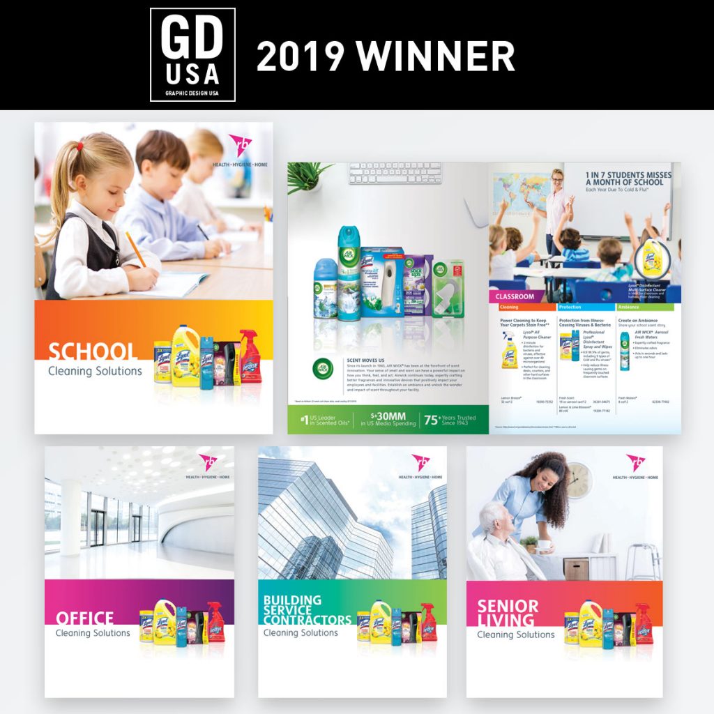
Vision partnered with RB Pro to develop a new brand identity and positioning for their line of professional products that was to be unveiled at an upcoming trade show. The new positioning was then rolled out across a series of brochures created to support their sales team. Each customized brochure targets a specific industry sector: office, building service contractors, schools, senior living, hospitality, fitness, and food service.

Designed to reinforce RB Pro’s new positioning of “creating wellness,” the brochures focus on how the company’s products help create clean, healthy and happy work environments. Since consumers already know and trust RB Pro’s world famous brands, such as Lysol, Air Wick and Easy-Off, the goal was to communicate best practices for how and where to use them within each industry.

The Vision team created an impactful and consistent design to apply to the entire line of brochures. Color coded for each industry, product usage is clearly defined by room and need. In addition, the wellness theme is reinforced through a mix of targeted professional and lifestyle images. As a result, the brochures are both visually appealing and educational, providing different industry sectors with effective solutions that match their specific requirements.

 Vision provided the overall design concept as well as copy writing and editing, research and recommendations for stock photography, and contracting and managing the printing for the brochures and associated collateral in time for the show. We then worked with RB Pro to roll out the design and theme across multiple platforms, including their trade show booth, promotional video and new website.

RBPro Brochures GDUSA Award


See Our Other Award-Winning Work:


The AMI Digital Summit: The Flight Crew Heads to Chicago

The AMI Digital Summit: The Flight Crew Heads to Chicago

Our Flight Crew makes penguins fly from the East Coast most days, but that doesn’t mean we don’t love spreading our wings every once in a while–especially when it’s to hone our skills so we can become even smarter, more efficient, and more digitally savvy when it comes to the latest industry happenings.

Creating the GDUSA Award-Winning Biovanta Website & the Relationship Behind It

Creating the GDUSA Award-Winning Biovanta Website & the Relationship Behind It

Winning a GDUSA award is always exciting because it’s both a celebration of our designers’ hard work and a time to reflect on our partnership with a client in relation to the project itself. We’re only as good as our last project after all, and our partnerships make us who we are. So let’s take a dive into not just creating the GDUSA award-winning Biovanta website, but into how it all came to be.

Grassroots Marketing

Grassroots Marketing

We recently brought a grassroots marketing campaign to life in Central Park for the family-owned snack company John Wm. Macy’s. Our experience got us thinking about the core aspects of grassroots marketing and audience engagement, and what it takes to create a successful campaign. It’s a layered concept, so let’s dive in together.
Award-Winning Design Series: Finlandia®

Award-Winning Design Series: Finlandia®

About Finlandia®:

Finlandia is famous for their quality and craftsmanship when it comes to their butter and cheese. Finlandia makes their delicious products using some of the purest milk in the world from small family-owned farms in Finland. These small Finnish farms have only 28 cows per farm. Finlandia cows are treated like family; each one is referred to by name and fed the greenest grass in one of the cleanest countries in the world. Finlandia carries a variety of imported cheeses as well as salted and unsalted imported butter.

The Insights:

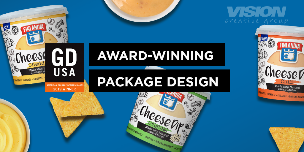
Finlandia was launching a new product line of quality spreadable/dip cheeses that are free of artificial hormones and GMOs. This new product line offers a premium cheese dip with a smooth real cheese taste that is perfect for entertaining. The new packaging design had to stand out on the shelf and clearly communicate that the cheese can be spread or used for dipping and is hormone free, NON-GMO, and made with quality grass-fed dairy.

The Strategy:

Since this was a brand new product line for Finlandia, it was vital to create a package design that stood out on the shelves while still keeping within the overall family brand look and feel. Our creative team incorporated imagery in the design that illustrated the many ways consumers can use the cheese dip products. The inside wrap of the packaging also includes recipes which builds on the multi-usage of this new product line.

The Results:

A fun, playful design ensured a strong shelf presence in supermarkets to capture shoppers’ attention while highlighting the product’s versatility and use of natural ingredients.

View Our GD USA Award Feature


See Our Other Award-Winning Work:


The AMI Digital Summit: The Flight Crew Heads to Chicago

The AMI Digital Summit: The Flight Crew Heads to Chicago

Our Flight Crew makes penguins fly from the East Coast most days, but that doesn’t mean we don’t love spreading our wings every once in a while–especially when it’s to hone our skills so we can become even smarter, more efficient, and more digitally savvy when it comes to the latest industry happenings.

Creating the GDUSA Award-Winning Biovanta Website & the Relationship Behind It

Creating the GDUSA Award-Winning Biovanta Website & the Relationship Behind It

Winning a GDUSA award is always exciting because it’s both a celebration of our designers’ hard work and a time to reflect on our partnership with a client in relation to the project itself. We’re only as good as our last project after all, and our partnerships make us who we are. So let’s take a dive into not just creating the GDUSA award-winning Biovanta website, but into how it all came to be.

Grassroots Marketing

Grassroots Marketing

We recently brought a grassroots marketing campaign to life in Central Park for the family-owned snack company John Wm. Macy’s. Our experience got us thinking about the core aspects of grassroots marketing and audience engagement, and what it takes to create a successful campaign. It’s a layered concept, so let’s dive in together.