The AMI Digital Summit: The Flight Crew Heads to Chicago

The AMI Digital Summit: The Flight Crew Heads to Chicago

The Flight Crew Heads to Chicago for a Digital Summit

Our Flight Crew makes penguins fly from the East Coast most days, but that doesn’t mean we don’t love spreading our wings every once in a while–especially when it’s to hone our skills so we can become even smarter, more efficient, and more digitally savvy when it comes to the latest industry happenings.

WHERE DID WE GO?

Recently a few members of the Flight Crew flew to Chicago for the Agency Management Institute (AMI) Digital Summit, an annual event that brings together agency employees in similar roles from across the country into one room to promote growth, sustainability, and connection. 

WHO WAS AT THE DIGITAL CONFERENCE?

After working and attending seminars remotely for two years, physically being in a supportive and collaborative space was refreshing. Capped at 50 participants, the group was intimate enough for conversation and big enough to allow for a variety of perspectives. Everyone from digital producers (content writers, digital art directors, social media managers), digital strategists and account managers to programmers (coders, developers)and digital media managers fluent in SEO and SEM attended.

WHAT WAS THE DISCUSSION FORMAT?

The variety of roles in the group was crucial because everyone sent in questions to be included in our discussion guide, and so the list was quite diverse. Each agency was able to choose one question to ask the group over the course of the entire digital summit. Of course, we scrambled to decide on the best question, but it became a dynamic and fast-paced conversation where we all shared our favorite tools, techniques, and tricks. Here are two of our biggest takeaways.
#1: MAKE TIME FOR MARKETING YOUR AGENCY

Easier said than done yet incredibly important, we discussed the struggle to balance how we prioritize our clients while also recognizing the need to tend to our own brand, communications, and messaging. Drew McLellan, founder of AMI, said it best: “It’s a difficult long-term battle, but those agencies that nail it and protect the time see much smoother ebbs and flows of business.” 

There was a moment of commiseration among the group, but then everyone sprung into action to come up with solutions. First was looking at big picture goals and breaking down these goals quarterly, monthly, and weekly. This keeps things from becoming too overwhelming. Second, revisiting the goals behind the different components of your internal marketing initiative often helps to remind you of why you’re doing it and keeps things feeling fresh. Finally, we discussed the difficult to achieve yet vitally important idea of maintaining a time budget for internal marketing projects. 

This way, the agency gets the attention it deserves without soaking up more energy from the team than it should. The Flight Crew came away from this conversation and set scheduled recurring internal marketing meetings with action items and due dates to instill a sense of purpose and keep big picture strategy in mind.
#2: PUT YOURSELF IN YOUR CLIENT’S SHOES 

One of the biggest topics of conversation throughout the digital summit was, of course, how we can best understand and work to fulfill our clients’ needs. Since every client is unique, the group broke down a strategy that could apply to every agency-client relationship. 

Ask yourself: Who is your client reporting to? What results do they need to represent success? And how can you be the agency that shows up and proves that you get it? First, it’s important to really connect with the client and for them to articulate what they’re looking for as best as possible. Concentrating on what their upper management wants to see and take away from a campaign rather than a few data points will give you a clearer idea of what data is important and what kind of takeaways you should be looking to draw out.

How do you determine which insights are important for not only your client, but for the person they are reporting to? 

  • What is the larger goal? It’s easier to start with what you know and the bigger concept, then widdle it down. Then, think about which data will relate most to this larger goal. This is the data to consider first. 
  • Second, what is the report/data going to be used for? Being aware of this will both inform how you look at the data itself and will show that you understand the client on a deeper level. The third point takes showing your understanding of the client a step further. 

How are we setting our clients up for success? This allows you to show your worth to your clients by being transparent and displaying your knowledge of exactly how your actions bring them closer to their goals. This makes it clear that you’re not only putting yourself in your client’s shoes during meetings, but always thinking about ways you can help them achieve their goals.

BRINGING OUR LEARNING BACK TO THE REST OF THE TEAM

We all agreed that attending the AMI Digital Summit was a revitalizing, educational, and inspirational experience. Not only were we able to absorb information from others in the industry, we were also able to pass on our learning to the rest of our crew. When we returned from Chicago, the entire team gathered at our agency (for the first time since the beginning of Covid!) for a presentation and group discussion about our takeaways. To say we left feeling energized and smarter would be an understatement. We can’t wait for the next learning opportunity!

The AMI Digital Summit: The Flight Crew Heads to Chicago

The AMI Digital Summit: The Flight Crew Heads to Chicago

Our Flight Crew makes penguins fly from the East Coast most days, but that doesn’t mean we don’t love spreading our wings every once in a while–especially when it’s to hone our skills so we can become even smarter, more efficient, and more digitally savvy when it comes to the latest industry happenings.

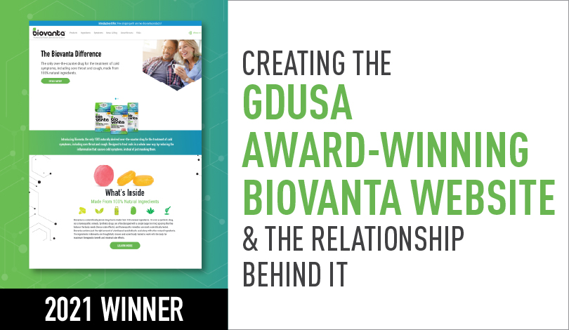
Creating the GDUSA Award-Winning Biovanta Website & the Relationship Behind It

Creating the GDUSA Award-Winning Biovanta Website & the Relationship Behind It

Winning a GDUSA award is always exciting because it’s both a celebration of our designers’ hard work and a time to reflect on our partnership with a client in relation to the project itself. We’re only as good as our last project after all, and our partnerships make us who we are. So let’s take a dive into not just creating the GDUSA award-winning Biovanta website, but into how it all came to be.

Grassroots Marketing

Grassroots Marketing

We recently brought a grassroots marketing campaign to life in Central Park for the family-owned snack company John Wm. Macy’s. Our experience got us thinking about the core aspects of grassroots marketing and audience engagement, and what it takes to create a successful campaign. It’s a layered concept, so let’s dive in together.

Creating the GDUSA Award-Winning Biovanta Website & the Relationship Behind It

Creating the GDUSA Award-Winning Biovanta Website & the Relationship Behind It

Creating the GDUSA Award-Winning Biovanta Website & the Relationship Behind It

Winning a GDUSA award is always exciting because it’s both a celebration of our designers’ hard work and a time to reflect on our partnership with a client in relation to the project itself. We’re only as good as our last project after all, and our partnerships make us who we are. So let’s take a dive into not just creating the GDUSA award-winning Biovanta website, but into how it all came to be.

Evolving All the Time: The Vision & Biovanta Partnership

This year, we had the privilege of redesigning, expanding, and optimizing a website for Biovanta, the only 100% natural over-the-counter drug for sore throats, colds, and coughs. If you haven’t heard of Biovanta yet, you will soon. Owned by a husband and wife and based in Brooklyn, they’re growing at warp speed and have been eager for an optimized, clean website to serve as their home base while they build out their distinct brand. We crossed paths with the young company a year ago when they needed a quick demo video of a product. It was important to have a quick turnaround so they could keep things in motion. After the demo, we started offering strategy and support for their Amazon assets and website. One thing led to another and we began collaborating on a full website redesign for this forward-thinking new business and product. 

The Ask

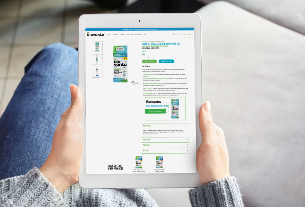
Even though this was technically a website redesign project, it was also an outward expansion in every sense. We added blogs, detailed product pages, and reviews to make the site more robust, and collaborated with our friends at Seasons Communications to optimize SEO and improve the user experience. 

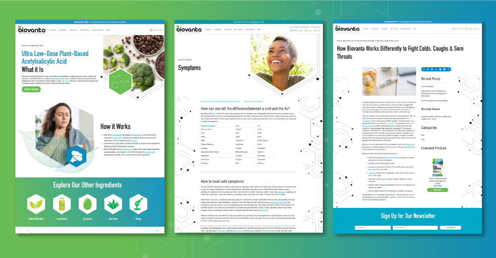
GDUSA Award-Winning Biovanta website redesign pages

Why Redesign a Website?

While a website redesign often conjures thoughts of new visuals, better functionality, and a cleaned-up look–all of which were part of this project–every web design project is different because it is rooted in strategy. Rather than simply aiming to make the site more pleasing to Biovanta’s audience’s eyes, we had to consider where Biovanta was in its journey as a business and what the site needed to accomplish when someone landed on it. Your website is your mothership in many ways; it is the place where your audience lands once you’ve captured their attention. It’s the place where you show your stripes and where your voice, values, and intentions need to be all-encompassing. In a way, you’re creating your own little reality for people to step into and experience. So, what does an all-encompassing Biovanta reality look like?

GDUSA Award-Winning Biovanta website redesign tablet view

Website Design & Branding: More Connected Than They Seem

Since this project was a redesign of an existing site rather than the creation of a site from scratch, we had to be careful not to tinker too much with the structure. As a budding, busy company, Biovanta needed to continue to keep their site available to their audience. We struck a balance between maintaining a level of consistency for incoming traffic and making progress optimizing different areas of the site. The site’s development was also driven by a quickly encroaching cough/cold season. Working closely with the client and their SEO partner made it possible for us to layer our designs with strategy, enabling Biovanta to take advantage of their new site when they needed it most.

No matter what the project is, branding always comes into play. Whether you’ve been around for decades or you’re just now crafting your identity, determining how to represent your brand is the eternal question. As a fast-moving company with countless opportunities on the horizon, ensuring that the Biovanta brand came across clearly on the new site was essential. The website design became a vehicle for building out the look, tone, and feel of the Biovanta brand. 

The Design & Look

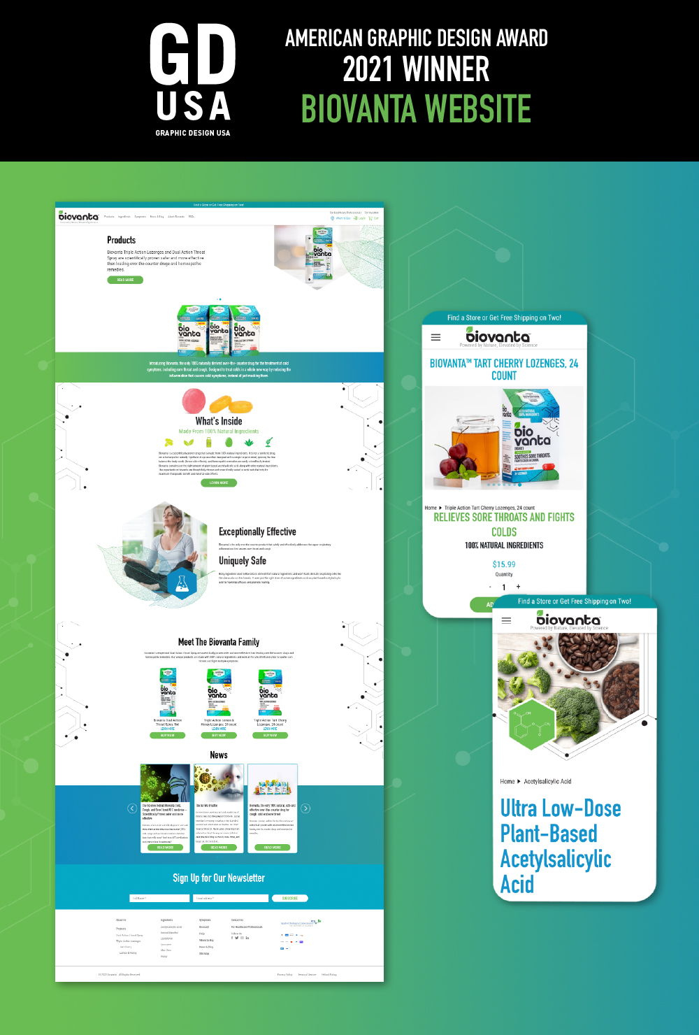
We kept it simple with a clean, modern, and user-friendly design, aiming not to over-design anything. Since Biovanta prides itself on its natural, simple ingredients and messaging to match, the site needed to embody those elements. Biovanta’s soon to be iconic blues and greens translated from packaging to website seamlessly. Their science-focused and confident identity came to life in a minimalist space with a fluid user experience. Icon-like graphics of ingredients and the consistent use of hexagonal shaped imagery makes clear associations with Biovanta’s foundation in science while also helping to create an uncrowded space that is easy to navigate. 

GDUSA Award-Winning Biovanta website redesign desktop and mobile view

The End Result

We were able to collaborate intimately with the client and get a firm grasp on what was essential to include. The results were easily accessible content pages filled with clear and empowering information, both about colds and how Biovanta’s products alleviate their symptoms. The space and user experience mimic the tonality of the brand and the effectiveness of the product–efficient, simple, and 100% natural. Creating the GDUSA award-winning Biovanta website truly paired strategic with creative, and working so closely with one another made the site look and feel like a cohesive representation of their vision and this incredible new brand.

We’re so proud of how far our partnership has come in the past year and we can’t wait for the next project. Cheers, Biovanta!

Thinking about your next website project? Contact us and we’ll get started!

The AMI Digital Summit: The Flight Crew Heads to Chicago

The AMI Digital Summit: The Flight Crew Heads to Chicago

Our Flight Crew makes penguins fly from the East Coast most days, but that doesn’t mean we don’t love spreading our wings every once in a while–especially when it’s to hone our skills so we can become even smarter, more efficient, and more digitally savvy when it comes to the latest industry happenings.

Creating the GDUSA Award-Winning Biovanta Website & the Relationship Behind It

Creating the GDUSA Award-Winning Biovanta Website & the Relationship Behind It

Winning a GDUSA award is always exciting because it’s both a celebration of our designers’ hard work and a time to reflect on our partnership with a client in relation to the project itself. We’re only as good as our last project after all, and our partnerships make us who we are. So let’s take a dive into not just creating the GDUSA award-winning Biovanta website, but into how it all came to be.

Grassroots Marketing

Grassroots Marketing

We recently brought a grassroots marketing campaign to life in Central Park for the family-owned snack company John Wm. Macy’s. Our experience got us thinking about the core aspects of grassroots marketing and audience engagement, and what it takes to create a successful campaign. It’s a layered concept, so let’s dive in together.

Award-Winning Design Series: G-SHOCK Tactical Product Catalog

Award-Winning Design Series: G-SHOCK Tactical Product Catalog

About G-SHOCK:

G-SHOCK watches are synonymous with toughness. It all started in 1981 with developer Kikuo Ibe’s dream of “creating a watch that never breaks.” Focusing on the “Triple 10” concept of 10-meter dropping shock resistance, 10-bar water resistance and 10-year battery life, his project team rigorously tested over 200 prototypes. The first G-SHOCK finally hit the streets in 1983 and soon established itself as “the toughest watch of all time.” Over the next 35-plus years, the G-SHOCK line expanded at a rapid pace, introducing new models and advanced features while retaining its iconic shock resistant structure. Today, G-SHOCK is one of the world’s most recognizable brands and continues to set the standard for timekeeping toughness with innovative technologies, functions and designs. 


Gearing Up for an Award-Winning Project:

During our 15-plus years of working on countless projects together, Vision has become completely immersed in the G-SHOCK brand. Each year, our team is tasked with updating the G-SHOCK tactical watch product catalog to showcase the latest timepiece releases and promote the entire tactical product line. The catalog is organized to separate the timepieces by model and colorway for easy selection and includes full product specifications. Vision provides the overall design concept, researches and recommends stock photography, and provides additional watch photography as needed. For this year’s edition, our team focused on deep, earthy colors and textures of rock and metal to speak to the virtually indestructible nature of the watches. The design brings a fresh look to the catalog while staying true to the line’s identity with images and elements that resonate with the primary audience of firefighters, military, police and emergency response personnel.


The Results:

The 2020 tactical catalog features an updated and impactful design that successfully aligns with the tactical theme. It’s sure to catch the eye of dealers and retailers and clearly communicates the functions and features of each timepiece. This year, we submitted our design for the tactical catalog to GDUSA Magazine for the first time, and we’re proud to say that we took home another graphic design award.

View Our GD USA Award Feature

See Our Other Award-Winning Work:

See all of our award-winning designs 2018-2020

The AMI Digital Summit: The Flight Crew Heads to Chicago

The AMI Digital Summit: The Flight Crew Heads to Chicago

Our Flight Crew makes penguins fly from the East Coast most days, but that doesn’t mean we don’t love spreading our wings every once in a while–especially when it’s to hone our skills so we can become even smarter, more efficient, and more digitally savvy when it comes to the latest industry happenings.

Creating the GDUSA Award-Winning Biovanta Website & the Relationship Behind It

Creating the GDUSA Award-Winning Biovanta Website & the Relationship Behind It

Winning a GDUSA award is always exciting because it’s both a celebration of our designers’ hard work and a time to reflect on our partnership with a client in relation to the project itself. We’re only as good as our last project after all, and our partnerships make us who we are. So let’s take a dive into not just creating the GDUSA award-winning Biovanta website, but into how it all came to be.

Grassroots Marketing

Grassroots Marketing

We recently brought a grassroots marketing campaign to life in Central Park for the family-owned snack company John Wm. Macy’s. Our experience got us thinking about the core aspects of grassroots marketing and audience engagement, and what it takes to create a successful campaign. It’s a layered concept, so let’s dive in together.

Award-Winning Design Series: MetTel 5G Presentation

Award-Winning Design Series: MetTel 5G Presentation

About MetTel:

MetTel is a leader in communications and digital transformation (DX) solutions. Founded in 1996, MetTel converges all communications over a proprietary network to give enterprises a single unified view and control point for all their communications and advanced network services. The company’s comprehensive portfolio of customer solutions can boost enterprise productivity, reduce costs and simplify operations. Combining customized communication solutions with a powerful platform of cloud-based software, the MetTel Portal® enables customers to manage their inventory, usage, spend and repairs from one simple, user-friendly interface.


Dialing In On This Award-Winning Project:

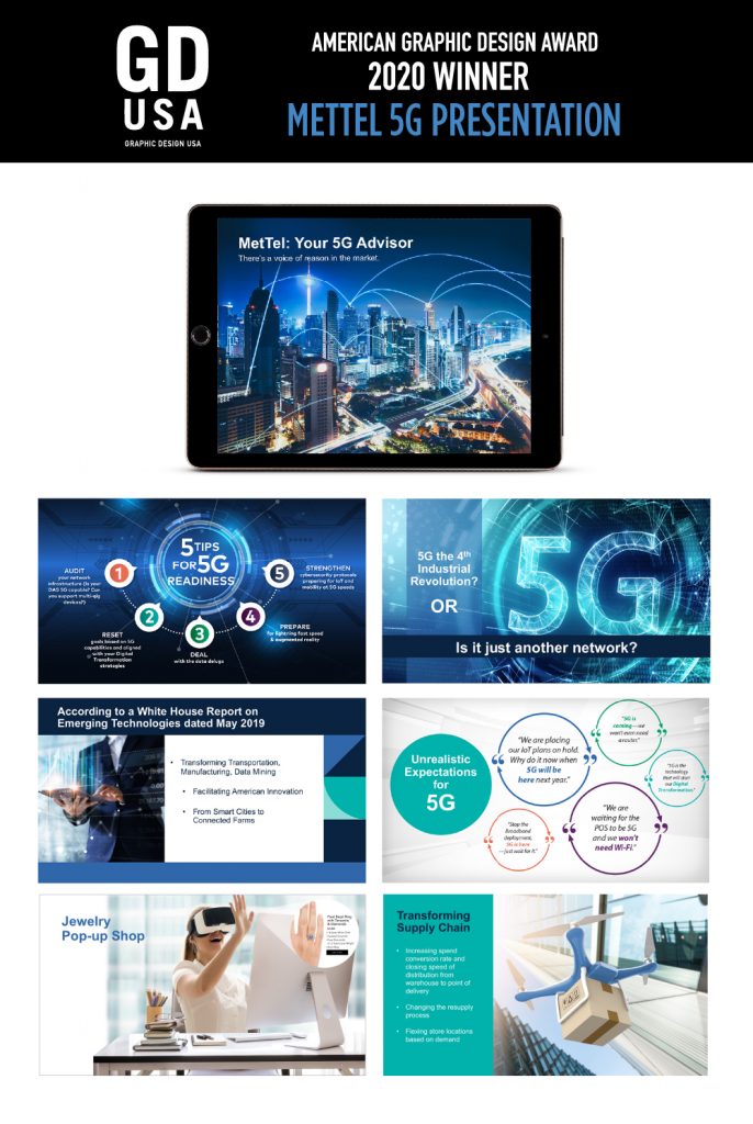
MetTel was preparing to serve as keynote speakers at the Gartner Symposium, the premier IT leader conference. They were looking to make a big impact and needed powerful visual support for two presentations: How 5G Will Help Retailers Survive & Thrive and The Potential & Perception of 5G for Government. Our team took on the challenge of creating key visuals that would take these concepts and bring them to reality. The main objective  was how best to illustrate 5G, connecting future technology with real-world usage, and bring it all together with MetTel’s comprehensive solutions.  We proceeded with a balanced approach, utilizing futuristic visual textures, patterns, animations and graphics, which were then complemented with renderings of real-world applications paired with informative and factual copy. The final product positions  MetTel at the forefront of their industry and helps the audience clearly understand the potential of 5G and how to evaluate and deploy this new technology.


The Results:

Our award-winning presentation garnered the attention and trust of the audience with precise messaging and a cohesive design. Showcasing MetTel as an industry expert that can separate the hype from reality and help businesses select the right 5G strategy and services, it made a strong impression on attendees and generated new business leads.

View Our GD USA Award Feature

See Our Other Award-Winning Work:

See all of our award-winning designs 2018-2020

The AMI Digital Summit: The Flight Crew Heads to Chicago

The AMI Digital Summit: The Flight Crew Heads to Chicago

Our Flight Crew makes penguins fly from the East Coast most days, but that doesn’t mean we don’t love spreading our wings every once in a while–especially when it’s to hone our skills so we can become even smarter, more efficient, and more digitally savvy when it comes to the latest industry happenings.

Creating the GDUSA Award-Winning Biovanta Website & the Relationship Behind It

Creating the GDUSA Award-Winning Biovanta Website & the Relationship Behind It

Winning a GDUSA award is always exciting because it’s both a celebration of our designers’ hard work and a time to reflect on our partnership with a client in relation to the project itself. We’re only as good as our last project after all, and our partnerships make us who we are. So let’s take a dive into not just creating the GDUSA award-winning Biovanta website, but into how it all came to be.

Grassroots Marketing

Grassroots Marketing

We recently brought a grassroots marketing campaign to life in Central Park for the family-owned snack company John Wm. Macy’s. Our experience got us thinking about the core aspects of grassroots marketing and audience engagement, and what it takes to create a successful campaign. It’s a layered concept, so let’s dive in together.

Award-Winning Design Series: Maxell USA Website Redesign

Award-Winning Design Series: Maxell USA Website Redesign

About Maxell:

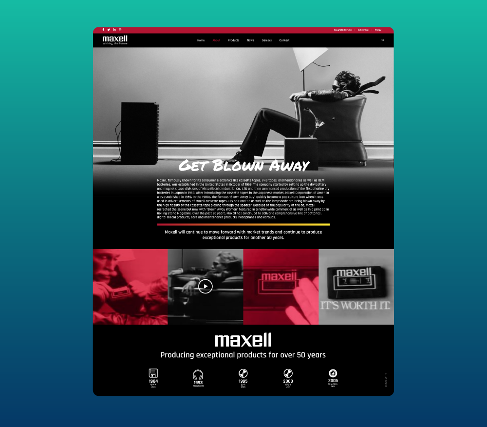
Maxell has been recognized for over fifty years for its exceptional consumer electronics, including cassette tapes, VHS tapes, headphones, and batteries. In addition to technological innovations, in the 1980s Maxell also gave birth to a true pop culture icon through its popular ads featuring the “Blown Away Guy” with his hair and tie being blown away by the high fidelity of the cassette tape playing through the speaker. Today, Maxell offers a comprehensive line of headphones, earbuds, batteries and digital media products as well as care, maintenance and storage products.


Kicking Off this Award-Winning Project:

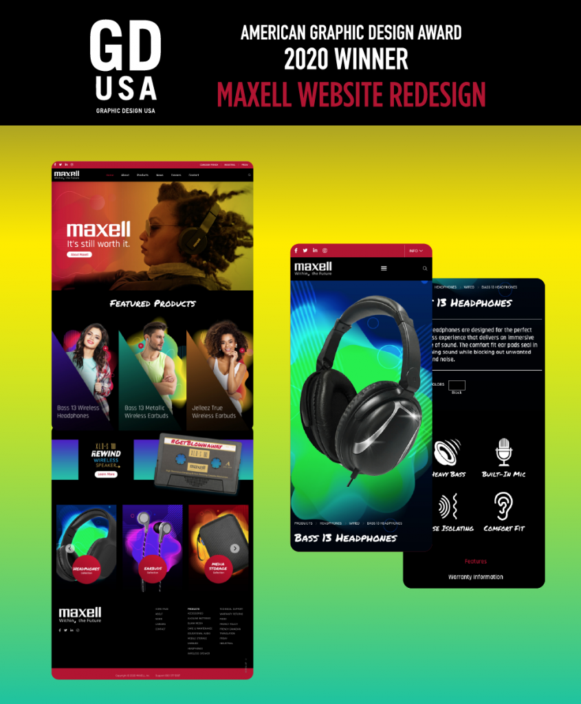
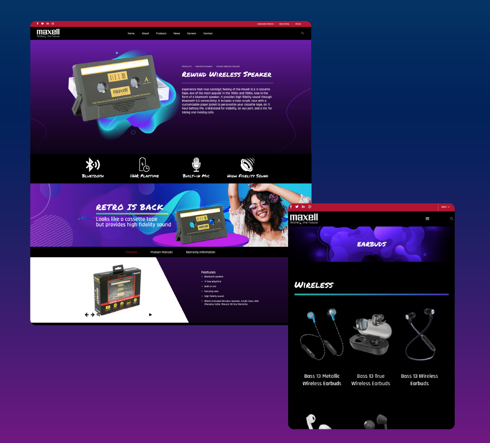
Hoping to reengage their brand with a new generation, Maxell came to Vision looking for a bold, new and responsive website that would reflect their retro-modern style. The original “Blown Away” ad and the newly reimagined 2005 revival featuring new products and a fierce “Blown Away Woman” both resonated with our team and inspired us throughout this project. We kicked everything off by completely immersing ourselves in the Maxell brand, really putting our fingers on the pulse of the company and what it means when they say “it’s still worth it.” Diving into their history, current product offerings, competition, target audience, brand positioning, and marketing objectives, we first partnered with Maxell on a creative brief and identified the goals for this project. Running with this knowledge, we then created a digital mood board, exploring colors, graphic treatments, and fonts with the mindset of paying homage to the charismatic nostalgia of the brand while creating a fresh, stylish design. Incorporating a mobile-first approach with the user-experience at the forefront, VCG then designed and developed a completely new WordPress website that communicates that their products are undoubtedly “Still Worth It.”


The Results:

Since launching the new website, Maxell has received positive feedback internally and from both customers and other companies. Extremely user-friendly, engaging and responsive, the website combines a cool, modern look with a nod to this classic brand’s history. We are proud to say the site’s design earned our team another award from GD USA Magazine!

View Our GD USA Award Feature

Maxell Website GDUSA Award Winner

Client quote: "Honestly it has been a great experience for the whole development on our website and new project. Since the launch we have received so much feedback and customers and companies reaching out to us. Truly helped us resurrect our brand. Vision made the process so simple. Working with their team was just seamless and made it easy. Now our new site is a great representation of our brand. Thank you so much, you guys are amazing!!! We are blown away from their service." Eric Walbrecht, Maxell USA

Maxell USA About us page

Client quote: "I am stunned at how well the final website came out! When we asked for creative ideas, Vision went above and beyond and exceeded our expectations in a very timely manner. The communication was constant and we always knew what stage the website was at. Overall it was a great experience working with you all, and I look forward to continuing work on more projects! Lori and the rest of her team at Vision are always super helpful and continue to exceed expectations. The team listened to our ideas and what we were looking for and went above and beyond. Our website came out amazing thanks to their creative ideas, expertise, and dedication. We couldn't have asked for a better website or a better team to work with!" Patrycja Mioduszewski, Maxell USA

Maxell USA product page and product category page

See Our Other Award-Winning Work:

See all of our award-winning designs 2018-2020

The AMI Digital Summit: The Flight Crew Heads to Chicago

The AMI Digital Summit: The Flight Crew Heads to Chicago

Our Flight Crew makes penguins fly from the East Coast most days, but that doesn’t mean we don’t love spreading our wings every once in a while–especially when it’s to hone our skills so we can become even smarter, more efficient, and more digitally savvy when it comes to the latest industry happenings.

Creating the GDUSA Award-Winning Biovanta Website & the Relationship Behind It

Creating the GDUSA Award-Winning Biovanta Website & the Relationship Behind It

Winning a GDUSA award is always exciting because it’s both a celebration of our designers’ hard work and a time to reflect on our partnership with a client in relation to the project itself. We’re only as good as our last project after all, and our partnerships make us who we are. So let’s take a dive into not just creating the GDUSA award-winning Biovanta website, but into how it all came to be.

Grassroots Marketing

Grassroots Marketing

We recently brought a grassroots marketing campaign to life in Central Park for the family-owned snack company John Wm. Macy’s. Our experience got us thinking about the core aspects of grassroots marketing and audience engagement, and what it takes to create a successful campaign. It’s a layered concept, so let’s dive in together.

Why Video is the Most Effective Marketing Tool Right Now

Why Video is the Most Effective Marketing Tool Right Now

Why Video is the Most Effective Marketing Tool Right Now

Let’s face it, the last few months have affected our day-to-day lives in more ways than we realize, from how we communicate to how we keep ourselves (and our families) busy and productive at home. We have had to adapt to a new normal in how we live, work and do business. Maintaining relationships and connecting with your customers is more important than ever, but it can be challenging with in-person meetings and in-store opportunities at a minimum. So, how can you capture your customers’ attention and communicate your message in this virtual world? 

The answer is simple: Video. 

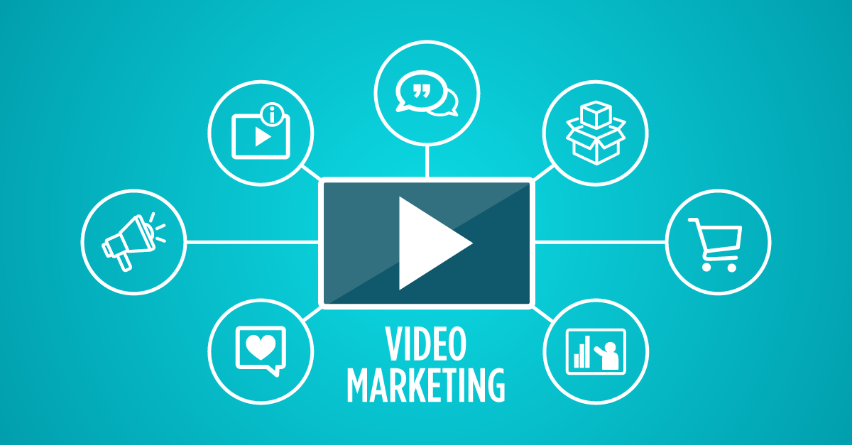
Video is the most powerful tool available for connecting with consumers. By utilizing video, marketers already get 66% more qualified leads per year.[1] It is estimated that 82% of global internet traffic will come from video streaming and downloads in 2022,[2] but we’d be willing to bet that our new reality has accelerated that trend.

No matter what your industry, video can play a key role in your marketing strategy.

Let’s break down the main types of video that can elevate your brand and help generate new business.

Brand Communication

Tell the story of who you are as a company and your core values through a powerful video. Whether it’s for internal communications or for your website, a strategic brand video can create a memorable personal connection to your employees and your consumers. With 86% of consumers saying they would like to see more videos from brands,[1] video is a great opportunity to further express the consistency of your brand’s voice and messaging through the most relevant medium while giving your customers more of the content they’re looking for. 

Product Demos and Education

Providing a product demonstration and educational content through video builds trust with your consumers and allows them to engage with both the product and the brand itself. These types of videos greatly influence your customers’ purchasing decisions. 84% of consumers say that they’ve been convinced to buy a product or service by watching a brand’s video.[1] 

Explainers

Explainer videos are considered the ultimate tool for connecting better with your potential customer, and for good reason! 96% of people have watched an explainer video to learn more about a product or service[3] with 74% ultimately buying the product.[4] Often featuring animation and special effects, explainer videos are a fun and engaging way to describe your product or service. Explainer videos are also used as a way of putting your product or service in a narrative context. This allows you to give a detailed representation of the problem that your product solves, emphasizing its usefulness to the consumer.

Events and Presentations

Video is a great tool for both in-person and virtual pitches for events, trade shows, and sales meetings. The combination of streaming and strategic video is becoming a popular trend, making it even more productive than a live event. Whether virtually or in person, a video allows you to communicate key information about your brand by attracting attention with a higher level of engagement than a traditional brochure or PowerPoint presentation.

Interviews and Testimonials

Interviews and testimonials connect your existing and potential customers in the same way a good old-fashioned referral from a friend would. Hearing positive stories and experiences from real people builds trust and provides much-needed human connection. These can be deciding factors for converting potential customers or clients. 

Social Media

With the prevalence of social media and the massive increase in screen time, we are oversaturated with content each day. So how do you get users to stop scrolling and see your posts? You guessed it, video. Engaging, informative and entertaining video is the most eye-catching type of media for your followers. 54% of consumers want to see more video content from a brand or business they support.[5] And, with users twice as likely to share video content with their friends than any other type of content,[3] you can easily expand your reach. 

E-Commerce

Using 360° product photography and promotional videos on social media and/or websites can increase conversion rates. Since most shopping starts online, including high quality video on your own site – as well as with Amazon and other major online retailers – can be the difference between converting a sale and a missed opportunity. With 360° product photography videos, you can provide consumers a virtual in-store experience with up close and personal views that bring your product to life.

The marketing world is constantly changing. Right now, there’s no better way than video to connect with your audience. Whatever your video needs, Vision is here to help. Our in-house video team will work closely with you throughout the entire process – from ideation to the final edit – to bring your story into the compelling world of video.


View Our Video Work


Ready to make video work for you? Contact us at info@visioncreativegroup.com and let’s make penguins fly together!


[1] Optinmonster 2019: https://optinmonster.com/video-marketing-statistics-what-you-must-know/

[2] Smart Brief 2020: https://www.smartbrief.com/original/2020/05/video-marketing-future-content-marketing/

[3] Wyzowl 2020: https://www.wyzowl.com/video-marketing-statistics-2020/

[4] VendeDigital: https://vendedigital.com/blog/importance-video-business/

[5] Hubspot 2020: https://www.hubspot.com/marketing-statistics/

[6] Cincopa: https://www.cincopa.com/blog/how-to-use-video-to-boost-landing-page-conversions/#:~:text=A%20study%20by%20eyeviewdigital.com,choose%20to%20watch%20the%20video

The AMI Digital Summit: The Flight Crew Heads to Chicago

The AMI Digital Summit: The Flight Crew Heads to Chicago

Our Flight Crew makes penguins fly from the East Coast most days, but that doesn’t mean we don’t love spreading our wings every once in a while–especially when it’s to hone our skills so we can become even smarter, more efficient, and more digitally savvy when it comes to the latest industry happenings.

Creating the GDUSA Award-Winning Biovanta Website & the Relationship Behind It

Creating the GDUSA Award-Winning Biovanta Website & the Relationship Behind It

Winning a GDUSA award is always exciting because it’s both a celebration of our designers’ hard work and a time to reflect on our partnership with a client in relation to the project itself. We’re only as good as our last project after all, and our partnerships make us who we are. So let’s take a dive into not just creating the GDUSA award-winning Biovanta website, but into how it all came to be.

Grassroots Marketing

Grassroots Marketing

We recently brought a grassroots marketing campaign to life in Central Park for the family-owned snack company John Wm. Macy’s. Our experience got us thinking about the core aspects of grassroots marketing and audience engagement, and what it takes to create a successful campaign. It’s a layered concept, so let’s dive in together.