Feeling blue? Seeing red? Green with envy? So often we use colors to help describe our emotions, but what about our color choices when it comes to marketing and branding? Are you consciously applying the use of color to evoke certain emotions? Color can help define a consumer’s perception of your brand’s personality. Not only that, color can help you stand out from your competition. Now it’s important to remember when choosing colors for your brand identity that not everything is just black or white (pun intended), meaning there’s no universal law that states using red, for example, will instantly boost your sales. There are many factors that come into play such as your industry, product, audience, etc. Let’s break down some important statistics that can be helpful when choosing the best colors for your brand.
Studies About Colors By Gender
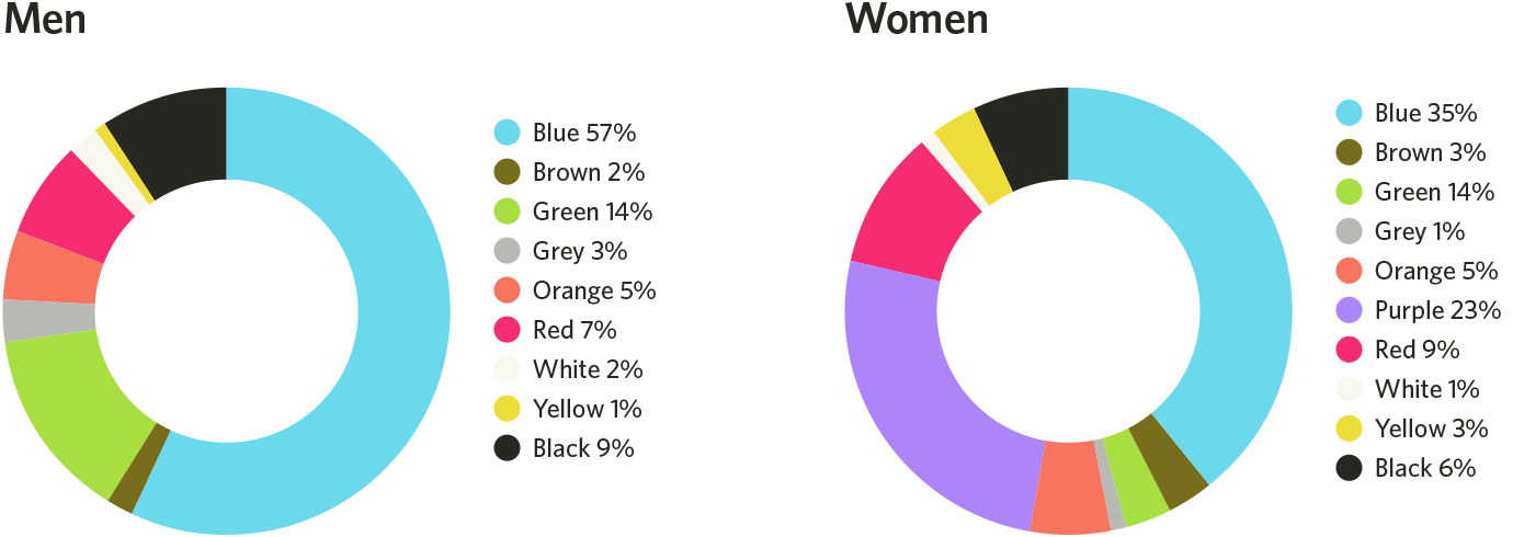
According to Joe Hallock’s Colour Assignment survey, 42% of people said that their favorite color was Blue out of a choice of 8 colors: Brown, Green, Grey, Orange, Purple, Red, White, Yellow, and Black. This data was then filtered by male vs. female, which showed that 57% of men chose Blue as their favorite, with Purple coming in second at 23%, and 35% of females chose Blue as their favorite, with Green in second at 14%. The overall unanimous least favorite color was Orange at 30% with Brown as a close second at 23%.
Favorite Colors
Least Favorite Colors
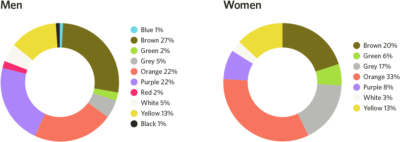
Image Source: Helpscout.net
There is also a difference between preference of color shades, tints, and hues between men and women. Another study found that men prefer bright colors and women prefer soft colors. Men are more likely to have favorite shades of colors (colors with black added), and women prefer tints of colors (colors with white added). Keep these in mind when selecting your brand’s color palette.
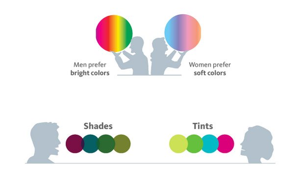
Image Source: KISSmetrics
Coordinating Colors & CTA’s
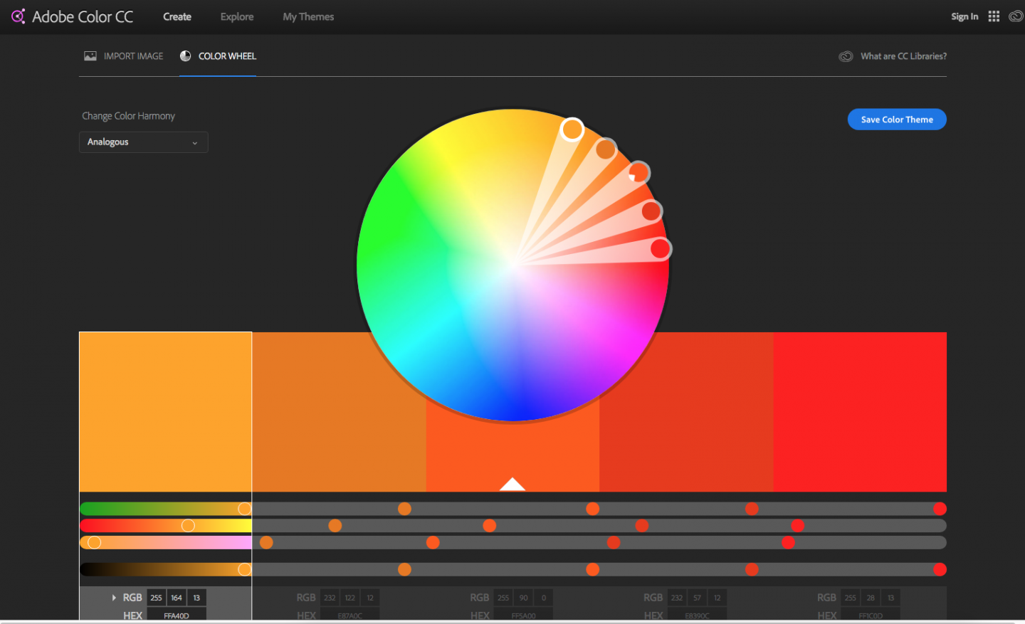
Ever create a call-to-action button in a bold color that pops and stands out? Of course, right? This utilizes the principle that the majority of consumers prefer color combinations of similar hues with a high contrast accent color. Creating a color palette with a hierarchy guides the consumer and lets them know where to take action. For example, if the majority of your ad or website consists of different shades of grey, use an accent color for your buttons, headlines, and important action items. This helps guide the consumer’s eyes to where they need to find all of the most important information and where to take action. Don’t know which colors go together and work for an accent color? Refer to color charts to help guide you in selecting your palette. Start with your analogous colors. Choose a few colors that are in the same family as your base colors and then choose an accent color that will pop and contrast but still make the text legible. Alternatively, you can use triadic colors when selecting your palette. Adobe Color CC is a great tool to use that helps you select the right coordinating colors.
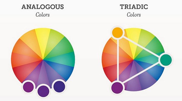
Here’s a great example of creating a color palette by choosing your analogous colors for your background and base colors, and then picking an accent color that complements then stands out.
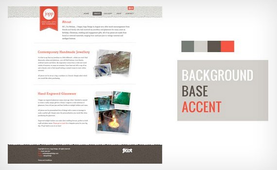
Image Source: StudioPress.com
The easiest example of how choosing the best colors has such an impact when guiding your consumers to your call-to-action button. The difference between the left to right is minor but makes a huge difference.

Image Source: Hubspot.com
Next Steps
It’s most likely that your company already has an existing logo with coordinated branding guidelines, but that doesn’t mean you can’t apply these principles in your other marketing efforts. It’s important to remember not to stray completely off-brand, however, try A/B testing different CTA button colors on your landing pages or display advertisements. Keeping this information in mind when creating visuals for your company can impact your customer’s journey and the impression of your brand.
Sources: Helpscout.net, Hubspot.com, StudioPress.com, KISSmetrics.com
